Colour branding

The Psychology of colour

Colour connects! It has deep psychological resonances and there is a burgeoning industry behind the psychology of colour in many aspects of our lives. A quick internet search brings forward hundreds of links to articles, papers and opinion pieces on the subject. If you refine the search further to include colour in events, the subject is equally well recognised and there are an abundance of experts to boot.

We all have a favourite colour and palette, and an industry has grown up around colour branding, from clothing to make-up, decoration to furnishings - and for a very good reason! Colour effects people in many ways, it effects moods, it can have a bearing upon buying decisions and it can alter the way people behave. It is, in fact, a very powerful tool for communicating subtly and effectively.

Colours in marketing your event

All marketers should take colour branding into account, when the colours of a company, its logo, its stand, and the stand uniforms being worn, are being designed. All communicate with visitors, whether you intend them to or not. So why not harness the potential of colours in marketing your event and build it into the design of your stand? By taking control of how colour is communicating to visitors at a show you can subtly effect their behaviour. In a busy show, with so many additional distractions, any slight competitive edge can make the difference between a good show and a great one.

Determining what you want visitors to do when they engage with your stand, whether they stay and relax or have a quick interaction and then move on, will help you decide on the colour scheme you should be using. The retail industry has used colours to great advantage as they have researched the topic thoroughly and understand how colour can motivate various buying actions.

Research on colour branding

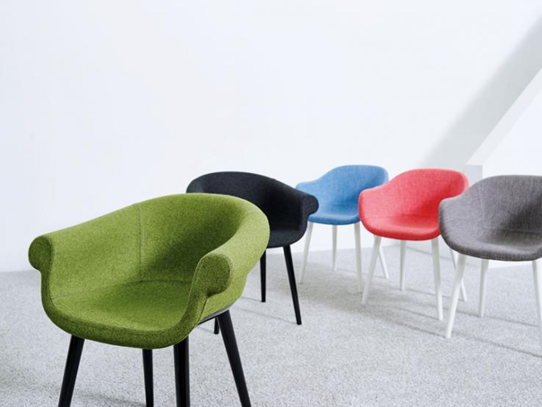
Research has shown that colour is the deciding factor for 85% of purchasing decisions made, which means colour is a powerful tool in the marketing armoury. Interior designers have used colour to define the atmosphere from cool and relaxing, using pale scours with soft lighting to create an oasis of calm, through to bright and vibrant colours to create a more dynamic and action based environment.

The atmosphere created on the stand needs to chime with your brand values and colour is key to this. Bearing in mind that research indicates that colour affects 80% of any subconscious decision made and that decision takes a mere 90 seconds to be made, incongruity will have a negative effect.

Because our subconscious is such a powerful part of our decision making process, it makes it one of the most important decisions to be made when designing a stand, it also means that corporate or brand identity must be consistent. Differences in corporate colours and mismatches will jar in the visitor's subconscious, and may make them feel uncomfortable for reasons they may not be able to articulate. In the frenetic world of a busy exhibition, the fewer hurdles that are placed in front of visitors when stand personnel are wanting to engage with them, the better.

There is science behind the use of colour in events, it has been recognised in branding and retail for a long time, perhaps so much so that it has become intuitive. Planning colour into the process at the beginning, making sure that it is consistently applied and works with the corporate or product brand could provide you with the competitive edge at a show.

The JMT website allows you to browse products by colour.